


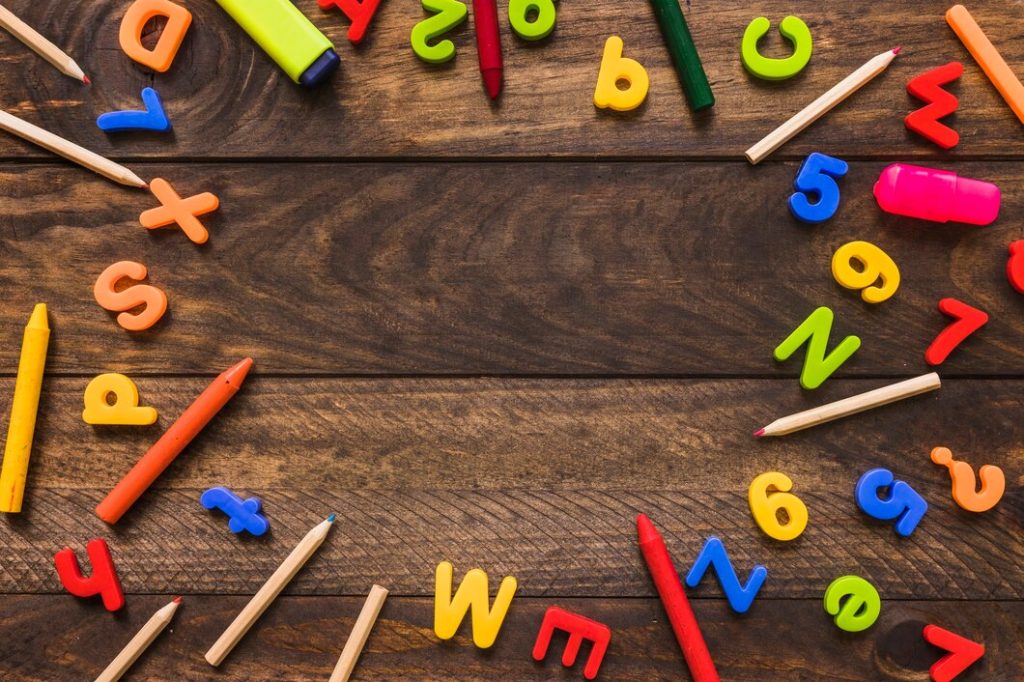
In our visually driven world, signs are not just informative but also a form of art. The letters used in signs play a crucial role in conveying messages effectively.
From storefronts to road signs, each letter is carefully chosen to ensure clarity, readability, and sometimes, even evoke emotions.
Let’s explore the intricate art of selecting letters for signs, where functionality meets creativity.
Understanding the Importance of Letters in Signs
Signs are more than just words; they are symbols that communicate messages to a diverse audience.
The letters for signs used must capture attention, convey information quickly, and reflect the brand or message they represent.
Whether in a bustling city street or a quiet countryside, letters for signs are designed to be noticed and understood almost instantly.
This ensures they make a positive impact by effectively guiding and informing people in various environments.
Factors to Consider When Choosing Letters
Choosing the right letters for signage involves careful consideration of readability, visibility, and durability factors.
Each element, from font size and thickness to material choice, contributes to creating effective and long-lasting signs that stand out in any environment.
1. Readability
Readability is paramount in signage. The letters should be clear and easily distinguishable from a distance and at different angles.
Factors such as font size, thickness, and spacing between letters significantly impact how well a sign can be read.
- Font Size: Choosing the right font size ensures that the sign is readable from the intended distance.
- Letter Thickness: Thicker letters often improve visibility, especially in outdoor settings or areas with varying light conditions.
- Letter Spacing: Proper spacing between letters (kerning) avoids visual clutter and enhances readability.
2. Visibility and Contrast
Signs need to stand out against their background to be effective. Contrast between the letters and the background color is crucial for readability, particularly in low-light conditions or high-traffic areas.
- Color Contrast: High contrast between letter color and background color improves visibility.
- Material and Finish: Reflective or matte finishes on letters can affect how they appear under different lighting conditions.
3. Durability
Outdoor signs face the elements daily, so the durability of the letters is vital. Materials must withstand weather conditions such as rain, sun exposure, and temperature variations without fading or deteriorating.
- Material Choices: Options range from metal and acrylic to vinyl and wood, each with its own durability characteristics.
- Weather Resistance: Selecting materials that are weather-resistant ensures longevity and reduces maintenance costs.
Styles and Aesthetics of Letters
Choosing the style and aesthetics of letters for signage involves balancing tradition and modernity, formality, and creativity.
Whether opting for serif or sans-serif fonts for clarity and perception, or incorporating decorative scripts for charm, each choice enhances the visual appeal and messaging impact of the sign.
1. Serif vs. Sans-serif
The choice between serif and sans-serif fonts can influence the perception and personality of the sign.
Serif fonts are often seen as traditional and formal, while sans-serif fonts convey a more modern and clean aesthetic.
- Usage Context: Serif fonts may be preferred for formal establishments or historical sites, while sans-serif fonts are popular in contemporary designs.
2. Script and Decorative Fonts
For signs requiring a touch of elegance or creativity, script and decorative fonts can add personality and charm. These fonts are often used in boutique shops, cafes, or artistic installations.
- Legibility Consideration: While decorative, these fonts should still prioritize readability to ensure the message is clear.
Psychological Impact of Letters
Beyond functionality, letters in signs can evoke emotional responses and influence perception.
- Emotional Tone: The shape and style of letters can subtly convey emotions. For example, rounded letters may appear friendly and inviting, while angular letters can suggest strength or seriousness.
- Brand Identity: Consistent use of specific fonts and letter styles can reinforce brand identity and create a cohesive visual language that customers recognize and trust.
Customization and Trends
1. Custom Signage
Businesses often opt for custom lettering to align with their brand image and stand out from competitors.
Custom signs allow for unique shapes, sizes, and materials that reflect the brand’s personality.
2. Current Trends
Trends in sign lettering evolve with design preferences and technological advancements. Minimalist designs with bold, simple lettering are currently popular, emphasizing clarity and modernity.
Conclusion
Choosing the perfect letters for signs involves a blend of artistry and functionality. Each decision—from font style and size to material and color—impacts how effectively a sign communicates its message.
Whether guiding pedestrians through a city or showcasing a brand’s identity, signs serve as powerful visual tools in our everyday lives.
By understanding the nuances of letter selection, businesses and designers can create signs that not only inform but also inspire and resonate with their audience.
In essence, the art of signs lies in the thoughtful consideration of every letter, ensuring that each contributes to the overall impact and effectiveness of the message it conveys.